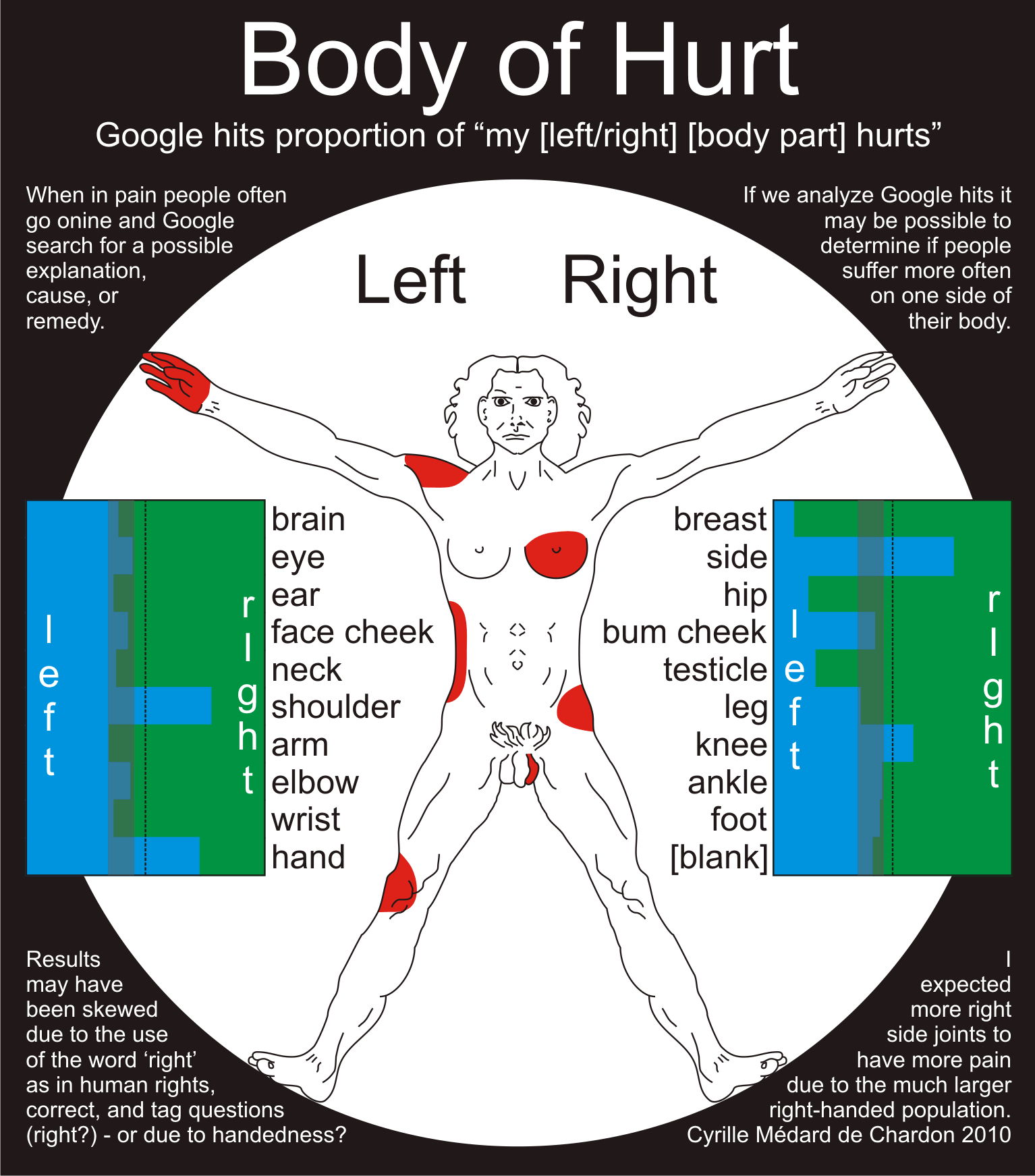
Body of Hurt
An infographic showing which side we report/ask more about pain on our bodies.
While Google provides analytical tools such as Google trends, it is possible to make deductions from the number of hits a search gets. Things people are more interested in will have more results. For some reason I began thinking about using Google hits to see if people have greater pain on their left or right body part. I opened a spreadsheet and began doing Google searches for ‘my [left/right] [body part] hurts’ for many body parts.
There was a definite skew in the number of right sided pain. I decided this may be due to the other uses of the word right such as in human rights, correct, and the tag question right? Perhaps there is some other effects from more right handers. I expected the right elbow to be a hot spot but it wasn’t. The large imbalances were largely a surprise.