How to lie with Charts
Charts, are a regular component of maps. Just like maps, subtle changes can distort the message that the data has. While maps must lie, by distorting space/scale, charts need not. Yet incomprehension, bias and desire to 'jazz-up' charts usually leads to false 'statements'.

If you’ve never read How to Lie with Maps by Mark Monmonier, now is the time. Since reading this book I have kept an eye out for examples of lying maps and charts. I am often rewarded with examples such as this:
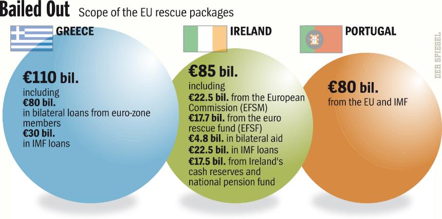
At first glance everything looks straight-forward. You may think that the middle sphere is the same size or smaller than the right one but this is due to the Ebbinghaus illusion. Look closer at the three shapes and the values they are suggesting they represent. There are three ways to depict chart data values. Using one dimension with a point, line or bar graph, in two dimensions using shapes or images scaled to represent area, and finally in three dimensions by depicting volumetric shapes. With simple data as in the one above no graphic is necessary, but it does help catch the eye. In this example the artist/author depicts the values of debt for the three countries using the area of the circles. The problem is that those are not circles, they are spheres. This misrepresentation exaggerates the difference in debt between the countries.
If you measure the radius of each circle (or diameter) and normalize by the smallest circle (Portugal) you may get as I did:
| Country | radius (normalized) |
|---|---|
| Greece | 1.169533 |
| Ireland | 1.027027 |
| Portugal | 1.000 |
By using the above values and calculating the area and volume of each circle and sphere you should get about (and normalize to Portugal’s 80 Billion):
| Country | Circle Area | Sphere Area |
|---|---|---|
| Greece | 109.4246268 | 127.9757306 |
| Ireland | 84.38276114 | 86.66337631 |
| Portugal | 80 | 80 |
You can see that the circle, not volume, calculations based on my graphic measurements best fit the values of 80, 85, and 110 values. So what is the impact of using the wrong calculation in terms of perception? By calculating based on the values and not on my measurements which are slightly off we can see what values the chart is actually depicting.
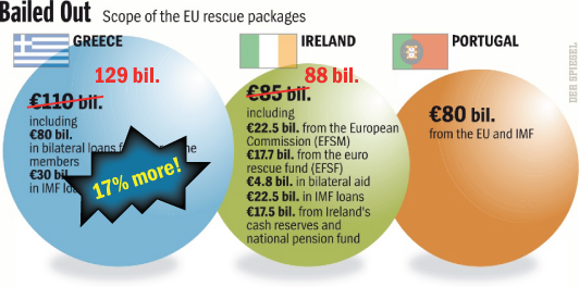
So a 17% error for Greece and only 3% for Ireland. Perhaps that is not so serious but it is still wrong. Luckily the values are quite similar otherwise the error would be largely exacerbated. Here’s a figure that shows three types of charts showing the correct value relationships.

Data that has small variations in percentages should be displayed using a bar chart to accentuate the differences in values. Area should only be used if there are large variations and spheres only for exponential comparisons.
Here’s another gem I found at work that lies by almost 1300% when compared to the smaller values.