Infographic failure
Infographics are power and effective, yet conversely can be empty of meaning, lie and communicate incorrect messages without the intent.

Infographics serve to simplify the communication of complexity by showing shapes, relationships, metaphors, hues, flows and symbols to represent values. A visually clean and attractive layout is common. We are more quickly able to compare visual values such as areas than numbers. Numbers and words require a more steps: deciphering (reading), translating to meaning and finally absorption. Visual symbols are directly absorbed.
Last year I purchased the book Information is Beautiful (IiB) by David McCandless. Its premise made me add it to my virtual shopping cart instantly. The book is strictly infographics about all sorts of serious, curious and funny topics. I was rather disappointed when reading it and discovered many incomplete pages. I became frustrated with the book and glossed over it a little quickly after that, admiring more the designs than the actual data. McCandless calls it a “freak printing error” but I wonder if it wasn’t partially from the last minute rush. I’ve watched his TED talk and I feel he may be a bit full of himself.
Infographics can fail at many stages. There can be an error in the research as in McCandless’ vitamin supplements graphic. These require you to know well the data to detect errors. There are also representational errors where the values researched are not represented correctly relative to other values. These are easier to detect if the author/artist also displays the values that the graphics are trying to represent. I browsed through IiB a few months back and looked at the data theft infographic. I quickly saw many representation and design errors. I admire his listed source materials / bibliography but I do not think he took to heart Tufte’s lessons.
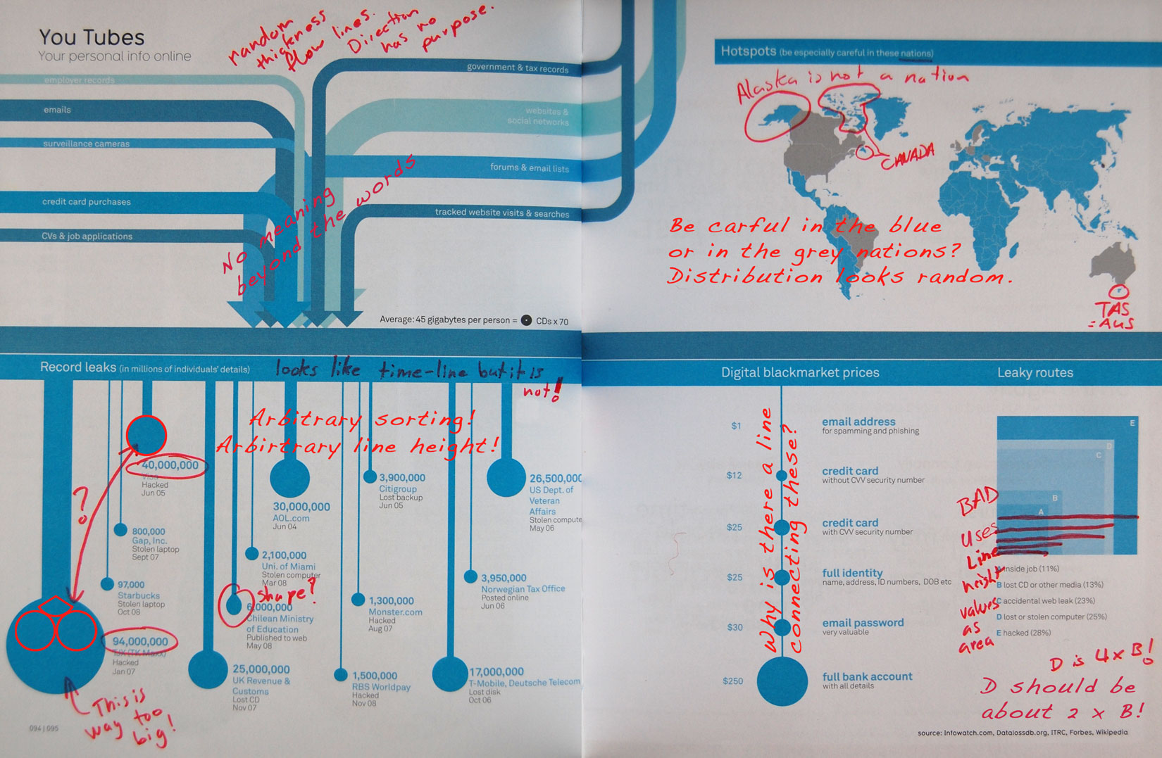
There are many issues I have with this info graphic. Some relate to incorrect representations of the values and others to design errors that mislead. The twin pages below are the offending infographic with notations added by me in red. I will address the four sections individually.
Cartographic mayhem
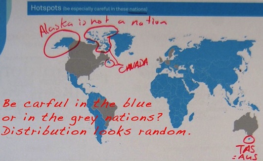
This portion of the infographic was clearly done in a hurry. I’m not sure what kind of precision the data were but I doubt that there existed special data sets for Alaska, Hawaii, Canada’s northern islands and Tasmania. These are clearly omitted. The map looks strange as well due to its binary classification. Classification is typically done to simplify the message. Selecting classes requires determining breaks that minimize variance within each class. This class break looks poorly chosen. I strongly doubt France has more in common with Mexico, Africa, Indonesia and China than Germany and England when it comes to data theft/loss hotspots. Also it’s not really a hotspot if it encompasses almost the whole world. This map needs a complete overhaul starting with several class breaks with a legend and a clear explanation of what this map is actually showing. It’s currently vague and I’m pretty sure wrong as well.
Area vs. height
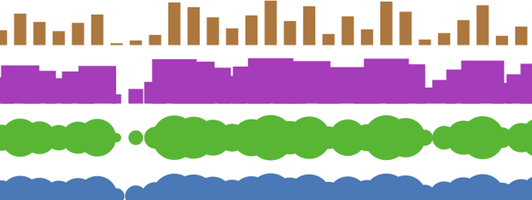
I have spoken before about the lie of scaling a representation incorrectly. McCandles needs to reread the chapter on graphical integrity and lie factors from The Visual Display of Quantitative Information by Edward R. Tufte. The squares represent the squaring of the actual values. The values should appear, in terms of relative representation, as in one of the following examples:
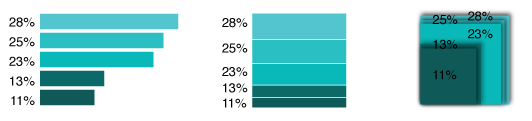
My examples not only correctly vary area but also colour. The original chose random shades of blue. Which design above do you prefer? Notice that this data contains percentages showing the sources of data leaks. Percentage data is most often shown in a pie chart for the reason that the data is strictly relative. It is therefore important that you be able to easily compare them. Of the three above charts only the left two clearly show all the areas each value represents. Infographic designers are often drawn towards the overly elaborate designs that look ‘cool’. Sadly these choices may compromise the communication of the values they are trying to pass on to the viewer. Perhaps flashiness is more attractive than correctness. Your fans may respect you but your peers will not.
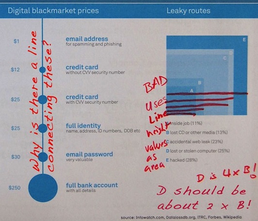
On the left side of this segment there are the ‘Digital blackmarket prices’. The line vertically connecting the circles has no function, it is purely a design choice. It inadvertently communicates a continuum, meaning that there exists a range of prices from lowest ($1) to highest ($250) that are not explicitly listed. If this was the goal of the designer than the circles should be distributed along the continuum according to their value, all pressed together at the top with the ‘full bank account’ circle isolated at the bottom. At least the circles are the right size here. That’s not the case in the next section.
More lies and chaos
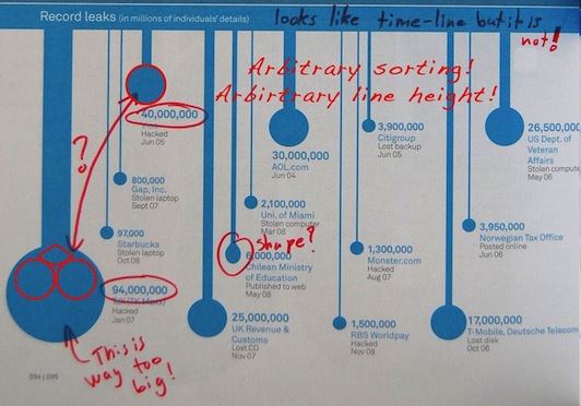
Record leaks. The first error is the subtitle ‘In millions of individuals’ details. The figure restates the data in millions. There’s also a sloppy circle near the middle of this segment. Like I said earlier I think this book was simply not edited sufficiently. Beyond those minor errors are the very same as in the last segment. A continuum error and value scaling. The image above clearly shows that the 94 million value is disproportionately large compared to the next largest value of 40 million a little above it. Beyond a simple scaling issue of the circles there is the scaling of the necks or bars holding the circles to the top line. While the neck thickness is scaled with the leak values, what does the length of the necks represent? Nothing, this is a design choice. The ensemble of these choices, I believe, also communicates a time spectrum. This is not the case. Their arrangement is arbitrary. This figure is misleading and utter chaos.
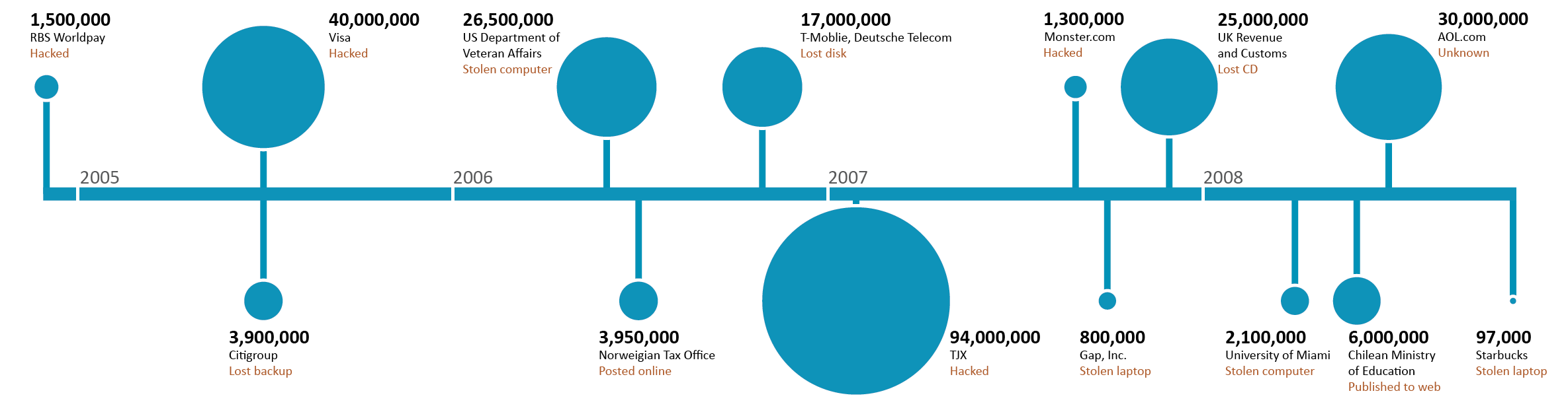
I have created a new version of this section that removes the randomness and gives the thefts a correct relative meaning and place along a time-line.
Meaningless line
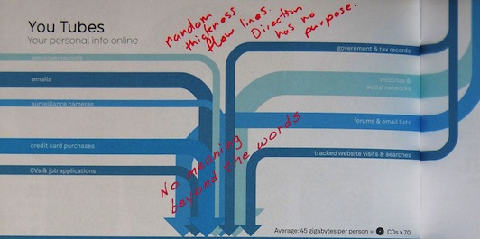
The final quadrant contains no actual data beyond the disguised list. All the tubes’ sources, thickness and colour have no meaning. This is purely a design element meant to animate the list of different types of our personal information that is online.
Conclusion
This figure is clearly a disaster. Infographics have bold goals. The reducing of complex data into a simpler visual message. This is not something a simple designer can accomplish without an appropriate understanding of depicting graphic representation accurately. Cartographers and statisticians take charts, graphs and symbols extremely seriously as they are central to their messages (see Charles Mindard’s map of Napolean’s march to Russia). I think the problem here is that there is a designer at the helm creating busy albeit impressive figures that often fail to communicate a correct representation of the values on which they are based. McCandell’s ‘You Tubes’ infographic is rampant with errors but is not the exception in Information is beautiful, representational and design errors clouding the messages are endemic.