Country population distributions
A mashup of Google graphs and maps.
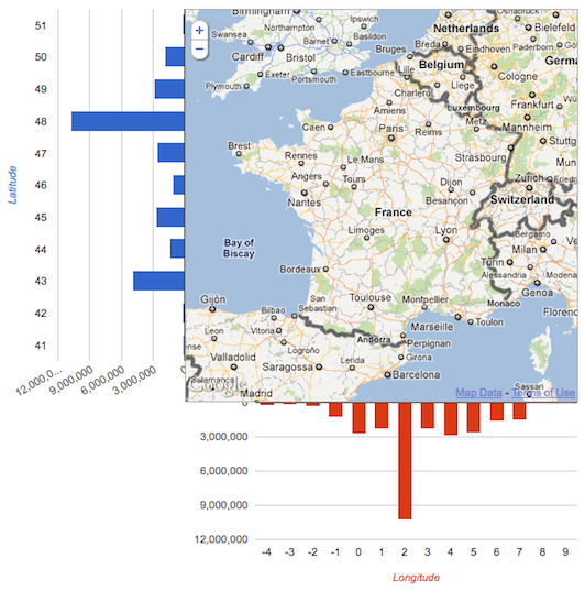
I have been pondering for some time what the result of displaying bar charts of latitude and longitude population distributions for countries would look like. A co-worker recently shared with me a site with city populations for the whole world. I finally managed to get around to creating a mashup of Google Charts and Maps.
The result is successful, selecting a country quickly displays the population distribution across latitudes and longitudes. There is one major limitation. The data set only contains populations of cities above a certain threshold. Canada is missing about 10 million citizens of roughly 33 million. Only 23,651,206 are included. I’m not sure how much this affects the resulting distributions. This should only affect distributions with large ‘bread basket’ areas of small villages/towns.
I also added a map overlay that shows the relevant lines of latitude and longitude to create an easier reference between the chart and the map. Here are a few examples (the live site is no longer functioning):
Australia

France
Pakistan

The World
This however was done a little differently as it doesn’t fit in the default display.