Cyrille MdC

FrakturMedia

GIS, transport, society and other analytical ramblings.

Country population distributions

A mashup of Google graphs and maps.

Cyrille MdC

1-Minute Read

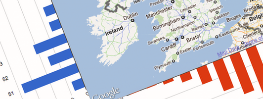
I have been pondering for some time what the result of displaying bar charts of latitude and longitude population distributions for countries would look like. A co-worker recently shared with me a site with city populations for the whole world. I finally managed to get around to creating a mashup of Google Charts and Maps.

How to lie with Charts

Charts, are a regular component of maps. Just like maps, subtle changes can distort the message that the data has. While maps must lie, by distorting space/scale, charts need not. Yet incomprehension, bias and desire to 'jazz-up' charts usually leads to false 'statements'.

Cyrille MdC

3-Minute Read

If you’ve never read How to Lie with Maps by Mark Monmonier, now is the time. Since reading this book I have kept an eye out for examples of lying maps and charts. I am often rewarded with examples such as this:

Bon Appétit: have an ad

An infographic critique of magazines and their too many ads.

Cyrille MdC

1-Minute Read

I don’t read magazines. I enjoy the Weekly Guardian newspaper and surf many websites for news. In reading the American ‘bon appétit’ cooking magazine that Julia gifted me for Christmas I have rediscovered that magazines have too much advertisement. Not only are there many explicit ads, there are ads masquerading as columns, and then there are the insidious ads where the magazine is blatantly pushing brand name items in their columns.

Recent Posts

Categories

About

Some data analysis ramblings on transport and society using GIS, R, Python, and other effective tools.